


ECAM SOLUTIONS | Visual Identity
[PT]
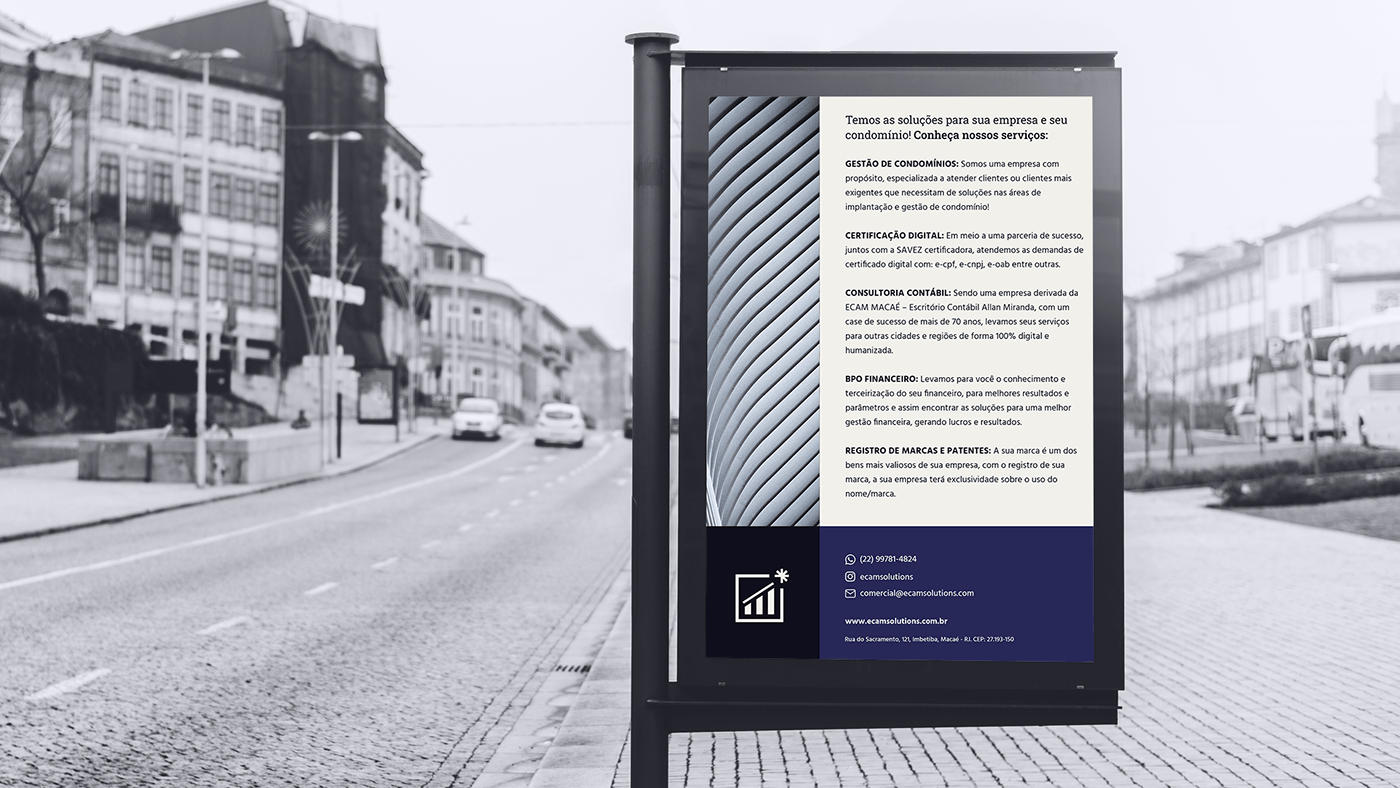
Sobre
Paulo Vitor Miranda nos procurou para desenvolver sua marca de soluções contábeis. Esta seria uma marca derivada da de seu pai Allan Miranda, a ECAM Macaé. Desejava uma identidade moderna e digital que conferisse uma atmosfera elegante e que remetesse de algum modo a marca mãe.
—
[EN]
About
About
Paulo Vitor Miranda came to us to develop his brand of accounting solutions. This would be a brand derived from that of his father Allan Miranda, ECAM Macaé. He wanted a modern and digital identity that would give an elegant atmosphere and that somehow refer to the parent brand.
—
Client: Paulo Vitor Miranda - Ecam Solutions
Task: Visual Identity
Designer: Carolina Moreira, Brazil
Studio: Agência Sollara Brands

[PT]
O Símbolo
Para a construção do símbolo tivemos como primazia trazer elementos da antiga marca de forma elegante e digital, de maneira que acompanhasse a tendência de mercado: formas simples e minimalistas, explorando o campo geométrico.
Neste símbolo, inserimos os seguintes elementos:
• Substituição (círculo > quadrado): substituímos o círculo pelo quadrado pois o mesmo agrega significados como solidez, estrutura, estabilidade e ordem, ajudando a marca a transmitir uma imagem confiável e íntegra;
• Seta/direção: representa o papel da empresa: conduzir os clientes na direção correta através dos serviços prestados;
• Soluções/raízes: representa às várias soluções (opções de serviços) prestados pela empresa. Também tem o intuito de representar as raízes da marca, a qual sempre levará consigo a essência de Allan;
—
[EN]
The Symbol
• Evolution/growth: main element arising from the previous logo. It represents success, achievement of goals, prosperity.
The Symbol
For the construction of the symbol, our priority was to bring elements of the old brand in an elegant and digital way, in a way that followed the market trend: simple and minimalist shapes, exploring the geometric field.
In this symbol we insert the following elements:
• Replacement (circle > square): we replaced the circle with the square as it adds meanings such as solidity, structure, stability and order, helping the brand to convey a reliable and integral image;
• Arrow/direction: represents the company's role: leading customers in the right direction through the services provided;
• Solutions/roots: represents the various solutions (service options) provided by the company. It is also intended to represent the roots of the brand, which will always carry with it the essence of Allan;
• Evolution/growth: main element arising from the previous logo. It represents success, achievement of goals, prosperity.


[PT]
As Cores
Para a concepção da paleta de cores utilizamos tons sugeridos por Paulo, porém, com alguma modificações.
A cor escolhida como a principal foi o azul. Ele é frequentemente associado à profundidade e estabilidade. Ele simboliza a confiança, lealdade, sabedoria e inteligência. O tom de azul principal é um pouco mais saturado, trazendo frescor, vida e aspecto digital.
O preto denota força e autoridade; ele é considerado uma cor formal, elegante e prestigiosa.
Já o branco é associado a modernidade e a simplicidade.
Finalizamos a paleta de cores com o dourado. A cor dourada está profundamente relacionada a tudo aquilo que indica riqueza material, grandeza, prosperidade e vitórias. É a cor da extravagância, da exclusividade, do prestigio social e da sofisticação.
—
[EN]
The Colors
The Colors
For the design of the color palette, we used tones suggested by Paulo, however, with some modifications.
The color chosen as the main one was blue. It is often associated with depth and stability. It symbolizes trust, loyalty, wisdom and intelligence. The main blue tone is a little more saturated, bringing freshness, life and digital aspect.
Black denotes strength and authority; it is considered a formal, elegant and prestigious color.
White is associated with modernity and simplicity.
We finished the color palette with gold. The golden color is deeply related to everything that indicates material wealth, greatness, prosperity and victories. It is the color of extravagance, exclusivity, social prestige and sophistication.


Sollara Brands – 2022
Todos os Direitos Reservados.
Designer: Carolina Moreira
**Clique aqui para realizar um orçamento!


